
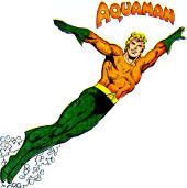
AQUAMAN: A more crustacean-looking armor was considered but ultimately deemed to be too detailed and "crusty" a look for the regal, majestic King of the Seven Seas. Maybe an Atlantean foot soldier will carry this mantle...
Define "abomination": See Above. What is the appreciable difference between "regal" and "majestic," anyway?
New 52's Day
- DCnÜ Wonder Woman design by Jim Lee @ Diana Prince
- Demon Knights #1 (November, 2011) @ The Idol-Head of Diabolu
- Grifter #1 (November, 2011) @ DC Bloodlines
- Bonus: Captain Atom: Armageddon #4-7 (2006) @ Power of the Atom







2 comments:
Looks pretty cool. It reminds me of the Atlantean soldier outfits from the Rick Veitch Aquaman series from a few year ago, but maybe that is just me.
The Irredeemable Shag
http://firestormfan.com
Aquaman is the one that bothers me less. I'm not a fan of armors, but the silver age uniform is missing something. I think the Brightest Day uniform is better.
The JLU version is missing something, but it's my favorite. Everything but the water hand.
Post a Comment